Pages

Showing posts with label experiment. Show all posts

Sunday, April 21, 2013

Cpt. Wayne Fan Art Process


I tried a little experiment with my fan art exchange this week over at Untold Tales of Bigfoot. First, out of the blue, Wouter Goedkoop generously sent me some Bigfoot fan art that incorporated the characters from his comic, Cpt. Wayne & The Unexplained Dimension. And then, in response, I decided to "reverse the camera" on the whole scene and do a flipped version of the same moment in time. It was fun. I posted some of the steps below.


The pencils. Wouter's characters are very futuristic -- polar opposites to my earthy Bigfoot and Scout. So it was nice to step outside my comfort zone and sketch something streamlined and high-tech.


Once the pencils are scanned into Photoshop, I ink them. Wouter doesn't employ the traditional black outline/filled-with-color that many comic artists use. His is a more painterly style. I could've played around with that, but I really wanted to see Wouter's characters done in a classic comic book style.


In Photoshop, I drop flat colors behind the inks. Again, Wouter's characters stand apart from my own comic in that he uses very bright, very saturated colors that explode off the screen. I wanted to honor that so I didn't dull down his palette too much when I colored his figures. It makes for a nice contrast with the organic background. After this step, I just add highlights and shadows (image up top).

If Captain Wayne and Gina intrigue you, head over to Cpt. Wayne & The Unexplained Dimension to check out the work of Wouter Goedkoop. -v

Thursday, March 28, 2013

Rare, hand-drawn Bigfoot and Scout (process)


I work dawn to dusk every day cranking out Untold Tales of Bigfoot pages so I can meet my weekly deadline. But it's all done on the computer, mostly in Photoshop. But I recently finished a commission for an image of Bigfoot and Scout done in brush pens and marker. I don't often draw these guys the old-fashioned way, and it was both fun and frustrating (no "undo"). Here's a quick rundown of the process.


I always start my Bigfoot comic pages with pencil. So that's nothing new. But the inks? Normally I do them on my Wacom Tablet in Photoshop. Easy to fix a bad line, no mess, just the way I like it. But this inking was done with pens, a brush pen for the thicker outlines and various fine point pens for the smaller details.


In the color stage, instead of dropping in fills on a different layer with the paintbucket tool, I had to bust out the Prismacolor markers. I was pretty careful, but I still got a little smear from the ink once in a while when the wet marker hit it (precisely the reason I left the fine fur detail for after the colors). I wanted the sky to be a bit more subtle than a big block of blue, so I Van Gogh'd that sucker. Or Seurat'd it. Whatever. Anyway, I was pretty happy with the outcome but even happier with getting back to the natural media process. So I'll be doing more of these for sure.-v

Sunday, September 2, 2012

Untold Tales of Bigfoot Webcomic, Page 001 Process


We're still in the early stages in the great webcomic experiment, but I thought I'd post the process for some of the pages. It's a learning exercise for me, so there may not be a lot of knowledge to impart here, but I always find work-in-progress steps interesting. Maybe you will too. This, of course, it the inking stage. Done in Photoshop over scanned pencils (which, apparently, I deleted) this is how it looks before color.


Next step, flats. Self-explanatory, I just paint in the flat colors of all the shapes. For no particular reason, I did the flats on a separate layer on this page. There are a few ways to paint in the flat colors, some people like to do it right on the "inks" layer, other people do it on a layer above. I'll probably try out different methods just to see which one suits me best. Anyway, without the inks…


…it looks like this. Weird, right? I tried a method where I filled each panel with a base color to help avoid gapping around the lines. Worked out ok for the first page, but everything's an experiment.


And this is the finished page, complete with highlights and shadows. Not bad, but I'm hoping as the comic progresses things will look even better and take much less time to create. That's the goal. To get better. If you want to follow along with the story and see if I get any better, check out the Untold Tales of Bigfoot. Updates every wednesday…if I can help it. -v


Monday, June 4, 2012

Max's Rocket Ship, Re-interpreted


Got a nice treat in my email the other day: an illustration of a rocket ship done by my good friend, Max. Glad to see three-year-olds are still interested in rocketing through outer space (and drawing pictures). Max's illustration inspired me to have fun with a little re-interpretation. I think Max is telling an epic story with this rocket image and it really makes me wonder what's going to happen when our astronaut friend lands on that mysterious, purple planet.    Although, Max's subsequent illustration of a hideous monster probably answers my question. -v


Friday, March 30, 2012

Ladies and Gentlemen...My Mother.

It's not really my mother. Barely looks like her at all.


But I recently noted that whenever I talk to her on the phone I end up filling any nearby paper with doodles. Before calling her today I decided to run an experiment. I set up a blank document in Photoshop, dialed her number, and soon after she started talking I started doodling. No plans. No preconceived ideas. Just free form doodling. My goal was to start when the call began and stop when we hung up.


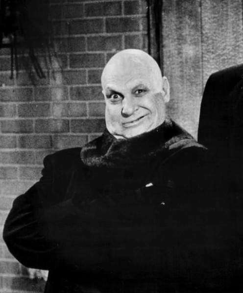
And this is what I got after about a half hour. It looked, at first, like it would end up as some sort of Uncle Fester doppelganger, but then my mother talked for an extra few minutes and the goon ended up with a wig. So. Successful experiment? Meh. To avoid creating a series of paintings of oddball goons, maybe next time I'll cue in on something my mother says and use that as a prompt. We'll see. I'm concerned that may end up as a series of "disappointed mother" images. -v


Thursday, March 15, 2012

Matthew Cody's The Dead Gentleman Illustration, Stage Four: Finishing This Thing

This should finally wrap up my Dead Gentleman draw-without-a-plan experiment. In this fourth and final stage I'll be turning that original doodle into some kind of book cover design because, well, why not? If you want to see the run-up to this, check out Steps One, Two and Three.


So when last we left Tommy and Jezebel, they were stuck in some creepy basement somewhere. It's dark down there so I have to paint in the flashlight beam. I used a soft-edged airbrush tool for that. Of course, with a new light source in the composition, there will be some shadows under the kids. This is where working backwards presents a problem that needs fixing: the room is a dark, blue cavern but the kids were colored like they're standing outside in the broad daylight. Gotta remedy that.


So I go back onto the layer where I painted the kids and do a little color adjustment. I darken them up a bit and shift their shadows toward blue. Not a bad start, but I still have to paint in a good deal of blue shadows by hand to make it feel real. Now that the kids look more grounded in that shadowy environment, I can flood the corners of the image with some darkness. Evil, threatening darkness.


What creeps around in that darkness? Attercops, of course -- hideous, spider-beasts with four multi-faceted eyes and venomous fangs. I thought adding big hairy spiders to the piece might be overkill, so I strung some of their webs around the basement as an indication of what lurks in the shadows. And what would The Dead Gentleman book cover be without some visual reference to the title character? The Dead Gentleman is a mysterious and powerful individual who terrorizes Tommy and Jezebel in his quest for world domination. Such a larger-than-life character needed more than just a literal representation. So I painted a scary, grinning skull and blended him right into the wall that's surrounding the adventurers.


Now that I've gone this far, I might as well throw on some title text to complete the book cover idea. The Dead Gentleman has a definite steampunk vibe to the gadgetry and vehicles, so I found a vaguely-steampunk typeface on my hard drive and dropped it in. Then, just for giggles, I threw it on a photo of the book to see how it would look in context. Not too bad. Not too bad at all. For a fake cover.


Just for comparison's sake, I'm posting the very cool, original cover by Odessa Sawyer next to the Vince Dorse, off-the-cuff, begin-at-the-end experimental cover. Two very different images but they both echo some very memorable elements in Cody's book. It's interesting to see how the same idea can be handled by two different illustrators who have vastly different styles and, I'm guessing, different artistic influences. Of course, unlike the original illustrator, I was working completely free of the constraints of any art direction from Knopf. And that's really a double-edged sword: you can draw whatever you want, but you don't get the feedback that can be essential to a good illustration. Feel free to read the book and decide whether or not I managed to hit the mark. -v


Friday, March 9, 2012

Matthew Cody's The Dead Gentleman Illustration, Stage Three: Background

The Dead Gentleman illustration experiment continues. Stage One was sketching out the linework, Stage Two I added in some color. Now, in Stage Three, I wing some sort of background and see how that turns out.


A few of the scenes in Matthew Cody's The Dead Gentleman take place in creepy basements and other dark, subterranean spaces, so that's where my initial idea for the figure drawing started -- hence, the flashlight in Jezebel's hand. But I had only a vague sense of a background, no solid plan. Despite my lack of a plan, I sketch out some random flagstones and the idea of a lichen-covered wall behind the kids. For composition's sake, I decide maybe I'll set up the whole illustration as a mock-up of a book cover. Why not? It's good practice.


Now I start throwing down color. Just a rough underpainting establishing color and mood. I want something creepy, so eerie blues and greens seem appropriate. The light sources in the image are going to be Jezebel's flashlight, some of Tommy's gadgets, and an indeterminate diffuse light source from off-camera.


I keep building up the shadows around the kids -- letting the brush take care of the texture -- and then paint in some flagstones on the basement floor. The stones look ok, but I may end up scattering some color on them later to break up the monotony. Also, they need to be grounded instead of just floating the way they are now.


To achieve that, I start building up shadow and texture to pull the whole room together. The wall looks like it has substance now -- and that aura of creepiness I was hoping for -- and the stones look like they're more or less set into the floor. There's still a bit of work to be done (like more direct treatment of the light sources and shadows) but for now this is a good stopping point.


So what's next? Does anyone care? Tune in next time as I finish up the experiment (hopefully) and we all find out exactly where this thing is headed. -v


Thursday, March 1, 2012

Matthew Cody's The Dead Gentleman Illustration, Stage Two

Ok, so the experiment continues with The Dead Gentleman illustration. Stage One was sketching out the linework, and at this point, I'm adding in color. So. let's see how that works.


The line is really just a guide for my colors, so the first thing I do is toss it on another layer and lower the opacity. Now, I just roughly scribble in some colors. It may be not be evident (or maybe it's painfully obvious) that almost every time I work on a new illustration I'm experimenting. Sometimes I start with greyscale tone, sometimes with color flats, sometimes there's no linework. This time I wanted a softer look so I brushed in some light color loosely, indicating lighting and some texture, and tried to proceed as if I were working on a traditional watercolor. How's it going to turn out? I don't know. Let's see.


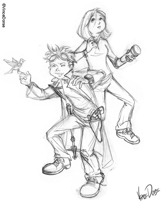
I choose a character to start on and work the colors until I like what I see. That's Tommy Learner, he's a time-hopping adventurer who hails from early 1900s New York. In Matt Cody's The Dead Gentleman, Cody does a pretty thorough job of describing Tommy's clothing and accoutrements, so I had a decent blueprint to follow. Tommy's a street kid, so I didn't want to make his clothing seem too pristine. Given his point of origin and lifestyle, I guessed he'd be limited to well-worn clothing of earthy hues, with a respectable amount of turn-of-the-century grime worked into the fabric. But he's also been outfitted with insanely futuristic, steampunk gadgetry like a Tesla Stick, net-gun, wrist chronometer and a clockwork bird of amazing abilities and mysterious origin.


Then I work on Jezebel Lemon. She's also from New York but a more modern version than Tommy's, so she gets a cute haircut and contemporary clothing complete with rubber bracelets and running shoes. She also, by the way, gets a new mouth between the sketch stage and the painting stage. Originally, I liked her subtle facial expression. But the longer I worked on her the more apparent it became that she needed a more definite look of surprise and fear. What's she surprised and fearful about? I'm telling you, you gotta read the book. But I'll tell you this: The Dead Gentleman is packed with creeps and monsters of all varieties and a (flying) boatload of action.


How does the illustration progress from here? Honestly, I have only a vague idea. I'm just as interested to find out as you are. Normally I like to have a plan but I thought it'd be more of an adventure to fly blind this time. Let's hope it works out. -v

Thursday, February 23, 2012

Matthew Cody's The Dead Gentleman : Illustration, Stage One

I'm trying a little experiment. I'm working on an illustration inspired by Matt Cody's newest novel, The Dead Gentleman, but instead of waiting until it's done and posting the work-in-progress steps after the fact, I'll be posting it as I create it. That means if I botch it, you'll get to ride that train right off the tracks with me.


The first steps I've posted here are the sketch phases of the main characters, Tommy and Jezebel. They're adventurers…but more on them later. First, lemme run down the three basic stages in the sketch phase of this illustration: 1)The loose rough, to establish composition 2) the polished rough, where I fleshed out the shapes a little better and 3) the refined, final pencils where I cleaned everything up. After this I'll post some color stages and maybe some other characters. I still have only a vague idea of how this will turn out.


Now, about the book -- The Dead Gentleman is the second book from Matthew Cody. Cody's previous effort, Powerless, was a fantastic book, well-received by critics and the public alike. I loved it so much it inspired me to create some fan art of my own (this and that). So I've been eagerly awaiting Cody's next book, The Dead Gentleman, and I wasn't disappointed.


Not wanting to give too much away, I'll say it's a book that takes place in two time periods (early 1900s New York and current day Manhattan) and follows the adventures of two teenaged protagonists, Tommy and Jezebel, as they battle dark forces from alternate dimensions, alien planets and beyond the grave. I'll tell you a little more about the book in my next post, but if you can't wait for that, find out for yourself and give The Dead Gentleman a try. It's a fun, creepy adventure that's perfect for night-time reading. -v


Thursday, November 24, 2011

Happy Thanksgiving!

It'd been a while since I drew one of these hand-turkeys. Decided to see how it would look if I used Photoshop along with a stylus and graphics tablet. Meh. I think my crayon-and-construction paper version was just as good.


Have a great Thanksgiving. -v

Saturday, December 25, 2010

Comic Strip Wrap (Christmas Wrapping Part 5)

This is the last major wrap-gimmick for me this year: A pile of gifts turned into a comic strip. First, here's the comic strip. I drew it for a couple of friends of mine who love Christmas, comics, cartoons and other fun stuff. Specifically, I turned them into cute little comic strip characters and wrote a Christmas gag around them. Fun, right? Below are the work-in-progress steps for both the comic strip and the wrapping paper gimmick.


1) First step is the pencil sketch, as usual. This one's pretty loose because Christmas was approaching and I didn't have time to do a finished, polished sketch the way I normally like to do. So the inking was done on the fly over some very rough doodles. Some panels (like the final) were pretty involved, so I made sure to tweak the sketch a bit before inking.

2) The inking was done in Photoshop. I was aiming for a very sweet, kid-friendly feel for the piece. So the lines are bold and bouncy. I did the lettering and word bubbles in Illustrator and imported them before step three.

3) Knowing I wanted this to end up looking like an old Sunday comic, I Paint-bucketed some desaturated colors and kept things simple.

4) After the color was in, I aged the entire piece by throwing a lot of off-yellow onto the piece. This way it looks like newsprint that's been sitting in your attic since 1979. The final step (which can be seen at the top of this post) is adding the half-tone texture to the illustration for that old printing press feeling. Now, on to the gifts.


1) I started by laying out the gifts I planned to give my friends in some semblance of a grid. Noting the size and shape of the gifts, I wrote the comic around that. Probably not the easiest way to write a comic, but I had an idea and I made it fit.

2) While I was busy writing and drawing the gag in my computer, I also began wrapping the gifts. I used this yellow, newsprint-type paper to give the comic an aged feel.

3) Once the comic was done, I used the packages to size the panels, printed out the line work, carefully cut out the panels and glued them on seamlessly. When they were finished, the packages looked like they were wrapped in paper with a comic strip printed on it. Since it's Christmas morning I can tell you it went over big. As I always hope, my friends had an agonizing time deciding whether or not to open the gifts and risk ruining the comic. After watching them meticulously cut through each gift's paper carefully with a pocket knife, I then rendered their efforts virtually pointless by handing them the full color comic, matted and framed. Merry Christmas. -v

Monday, December 20, 2010

Scavenger Hunt Robot (Christmas Wrapping Part 3)

Ok, here's a bit of fun. My friend who likes robots is getting this put-it-together-yourself paper robot from me for Christmas. But the robot isn't the gift, really. The robot will be scattered in secret locations around his house, each piece containing instructions on where to find the next piece. The third and final piece of the robot will tell him where to find his actual gift. And on the slim chance that he actually reads this post, I can't reveal what the gift is (though it'll probably be some kind of robot). Work-in-progress steps below.


1) this was the rough sketch of the robot, which I then scanned and placed in Illustrator.

2) After tracing my sketch in Illustrator with the Pen tool, I colored it, printed it and cut it out.

3) Here's the leg support piece, cryptically inscribed with instructions to find the torso.

4) And, finally, here is the horrible cell-phone photo of the assembled robot.


After he finds his actual gift, he can spend the next few minutes assembling his paper robot and marveling at how clever his friend is. -v

Saturday, June 12, 2010

Bigtooth And Sourpuss

This is just an experiment. I'm warming up for a bigger project involving sequential comic art, so I decided to work out the kinks with a few test runs first.


This one, Bigtooth and Sourpuss, is based on a story a friend once told me about a minor childhood trauma. Traumatic for her, hilarious to me. But the story's only secondary to my purpose. My primary goal was to experiment with different types of inking and coloring techniques. Verdict? Meh. It's not too bad for a first run, but I want to dig a little deeper into the mechanics of creating a comic before I take a second shot at it.


And though I really dig experimenting with the "wear and tear" technique that makes this comic look like it's been rotting in my attic since the '70s, I'm not sure if I'll be able to keep that for the final project. You know, that big, secret comic project I got you all excited about in paragraph one. But for these warm-up exercises, the old worn look is kind of fun.


There are various stages of work-in-progress below, including a black-and-white version I decided to nix. I can only hope it's good enough to bring back horrible memories for the person who told me the original story. -v


Tuesday, May 25, 2010

Sifting Satellites From Stars

A friend of mine was recently downsized out of a job. You might know somebody in the same position, there are plenty of them out there. This particular friend of mine happens to be a pretty smart guy with an industrial-strength work ethic. For the last few months he's been topping off 10-hour work days by studying for an MBA. Glutton for punishment, I guess.


So, while the unexpected retirement may have long-term positive effects on his grades, he hasn't really slowed down. He started a daily blog to document his journey through unemployment, online education and, as it happens, poetry. And that's where this all ties together.


This illustration is based on a poem from his blog. I thought it might be a fun experiment to read those poems and use them as a springboard for illustrations. Challenging too...because half the time I don't know what the guy is talking about. Anyway, this is my own spin on his poem. Not sure what he had in mind when he wrote it.


If you feel like following along to see whether or not my friend eventually gets that MBA and lands the new, high-paying job he deserves (or ends up destitute and starving) feel free to follow his blog, Unemployment and Poetry. And if you just want to read the poem this illustration is based on, it's called crime scene. -v

Sunday, March 28, 2010

My Cat Is Bored. Again.

When my cat is bored, she maows incessantly. The kind of maow that cuts into you like fingernails on a chalkboard. I try to ignore it while I'm working because I can't stop every five minutes to scratch her neck.


But now she comes back to my desk and, balancing herself with her left hand on my knee, stands on her hind legs so she can reach up and tap-tap-tap on my drawing hand. Gah! If it weren't so cute I'd sell her because it's driving me nuts. And that ball she won't play with is only about the 13th one she's grown tired of.


I drew her to experiment with a different coloring technique. The work-in-progress steps are posted below. It's a little more loose than I normally color and it was done very quickly because there was a cat tapping on my hand. -v

Sunday, March 21, 2010

Laziness Is The Mother Of Invention

I've been busy with a secret project lately, so I honestly had nothing to post this week. In a bout of supreme laziness, I thought I'd just post an old gag cartoon I did about five years ago. But when I saw it, I realized that, had I drawn that gag now, it would've looked completely different. So I took another run at it to see the difference five years makes.


How has my approach to this particular gag changed? Right off the bat you can see that now my mice are cute (left), as opposed to that bizarre cat/mouse hybrid in the old cartoon (below). Also, because I don't obsess over linework the way I used to, the drawing is a lot looser and carefree. Same thing with the coloring. I don't waste precious minutes speckling the floor with texture or highlighting woodgrain. Apparently, five years ago I had a lot of time on my hands.


So, five years later it's a completely different cartoon. The gag line's still funny, but I'm pretty sure I'm the only one who thinks so. For everyone with a heart of blackest coal who doesn't find my marshmallow gag hilarious, I tossed a few options there on the bottom. Enjoy. -v


Wednesday, January 13, 2010

An Angry Doodle

I was relaxing with some doodles last night and this angry little person showed up on the page. She turned out ok so I thought I'd experiment with a different coloring technique. It's still digital, but I left it a little looser than I normally would, not a lot of cleanup. It's ok, but I need to experiment a little more. -v

Thursday, October 1, 2009

It's Not Art...It's "Artsy"

October's here and, to celebrate, I've decided that even birthday gifts get to dress up for Halloween. These are some presents I recently wrapped for a friend whose birthday is next week. One of them is the Batman Begins DVD, another one is the Dark Knight DVD, and yet another is a book about Bigfoot. Which is which? The world may never know.


The gag here is to make birthday wrapping so engaging that the recipient is wracked with guilt over opening the gift. Most of it was done with simple construction paper, but Bigfoot needed some texture so I used a sheet of downy brown felting and some fur for the eyebrows. And rest assured, there is so much glue holding that Bigfoot wrapping on he'll never get it open even if he tries.


And, no, he's not gonna see what I got him for his birthday because he doesn't read my blog. So there. -v

Monday, September 28, 2009

Gallery Page Illustration : Final Step ( an expert's opinion)

You think your friends like to go on and on about what they know? Try bringing a drawing into a room full of illustrators.


Normally I like to get some outside opinions earlier in the process, but this sketch went so fast I was almost done before I asked for critiques. But I'm glad I did. My illustrator friend, John, thought alternate metals on the robot might look fun. Gotta agree. The brass metal against the steel really pops.


As well, most of my friends felt the original sketch had a spark of life and electricity that might have been hidden in the color layers. So I brought back some of the looser, more organic aspects of the original sketch line. It's something I'll keep in mind for the next illustration too. Never discount what another set of eyes can do for your image.


In the end, for just a few hours work, I like it. I know I could push it farther, make the textures more photo-realistic or tweak the contrast even more. But I like to stop here. This looks like a half-decent children's illustration to me. So much so, that I'm posting it on my website as the gallery opener. So if I didn't bore you to death with all this "process" stuff, go check out some of the other new illustrations in my gallery. Thanks. -v

Sunday, September 27, 2009

Gallery Page Illustration : Step 4 (correcting a grievous error)

Step four, fixing my mistakes. I was so busy in the last step worrying about contrasts and texture that I hadn't realized the hastily sketched hands of the boy didn't look right. So they need to be fixed.


First, though, I wanted to paint in a very basic environment. Just a ledge, really. But with a defined light source (the robot's headlamp) I can define the ledge with the cast shadows under the figures. All good, but those hands have to get gone.


I redrew the hands so they looked like they were holding the book. I don't really use reference that often, but I needed this to be right so I took a picture of myself holding a book. You can see the comparison down below.


Now that all of the major problems with the piece have been addressed, there's just one more important step -- critiques from my bigmouth illustrator friends. Should be fun. -v