Pages

Showing posts with label design. Show all posts

Tuesday, January 29, 2013

Morels: Pan


The Pan Card in the game Morels is necessary if you want to win. There are plenty of them in the deck, but knowing when and how to play them makes all the difference. Here's a quick breakdown of my illustration process for this valuable card.


The image starts with a pencil sketch, toned with warm and cool colors to help the illusion of a nighttime campfire. As will the other Morels cards, I use the pencil sketch as a map for the colors, done in Photoshop. The base of the background is done with a simple gradient covered in a rough-edged brush to lend texture.


I create a custom brush for the glowing embers of the campfire. Then I start brushing in sweeping, undulating strokes of orange, yellow and white to start building up the fire. Then it's just a matter of using blurs to give the fire movement, and more texture laid down on the base. After that it's ready for the border to cover up all those unfinished edges.

As always, if you'd like to find out more about Morels, you can read reviews and gameplay reports at Board Game Geek. And you can order your own copy directly from game designer Brent Povis at the Two Lanterns Games website. -v


Sunday, September 16, 2012

Morels: Tree Ear


The Tree Ear has to be, without a doubt, the creepiest weirdo mushroom I had to draw for Morels. It really does look like a human ear and it grows in the eeriest of swamps on the creepies of dying trees and if I ever came across them in the wild I'd run as far from them as possible. Yeeugh. Let's break down the process quickly so I can stop thinking about it.


The first image on the left is the approval sketch for the Tree Ear. Then, after Brent yelled at me about the leaves on the Mangrove tree, I pored through more reference and sent him the second drawing. It was approved, thank goodness. Finally, you see the ultra-rare, never-before-seen, designer-edition chase card. If you find this card in your game, Brent will come to your house and cook you a mushroom feast.


Here's a quick breakdown of the illustration process. Everything looks fine at the pencil sketch stage. Then, as soon as I start laying in color, it becomes and ugly mess. All part of the plan. 


Once the tree trunks are painted in, things start to take shape. The shafts of light were specifically called for in the brief (for a detailed tutorial on how to create shafts of light, just search "shafts light Photoshop" and the internet will give you more methods than you can count).


Finally, moving to the night card, it's all about shadows and recoloring. In some areas, a simple color overlay is needed. In others, I had to paint in bluish shadows. As a finishing touch, I use a soft brush to dot the surface of the swamp with glistening points of light. Now it's the perfect spot to dump the bodies. 

As always, if you'd like to find out more about Morels, you can read reviews and gameplay reports at Board Game Geek. And you can order your own copy directly from game designer Brent Povis at the Two Lanterns Games website. -v


Thursday, August 30, 2012

Morels: Lawyer's Wig


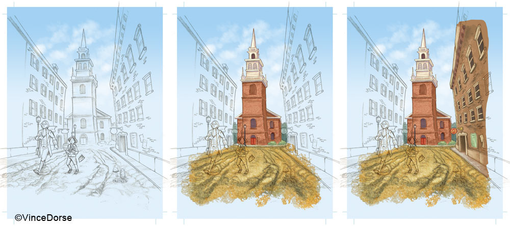
The Lawyer's Wig was the 8th card I illustrated for Morels. It was a chance to draw people (a rarity in this card set), and an opportunity to do some historical research and practice some architectural illustration (ugh). But most of all it was a puzzle to figure out how to fit a giant building with important details onto a 3-inch card. Listen, my children, and you shall hear how I used forced perspective to make far things seem near...


First I warped a photo of the Old North Church to see if I could stuff it inside the card borders and still allow for some close-up foreground work. Maybe. But clearly the mushrooms looked like something out of Day of the Triffids so that had to be modified. I also went back and forth with game designer, Brent Povis, on historical accuracies: Did the original church have two louvered windows up top or a giant clock? Would that fire escape structure on the right building have been there in 1775? Brent did days worth of research to come up with the answers.


This was the final approval sketch for the Lawyer's Wig. As you can see, reality was bent slightly in order to get everything to fit (and be visible). In the end, the smaller mushrooms and the subtle lantern lights turn out to be nice "a-ha" elements in the composition. And the forced fisheye effect works well with my slightly cartoony style.


All that's left is layering on the color with various brushes, trying to represent the different textures in the illustration. You can follow through my steps here and watch the card come together in virtually the same sequence I did.


As I said, the trick was fitting everything in so that the composition allowed for a fairly close shot of the mushrooms, and a full image of the Old North Church Tower large enough and close enough so that the two lanterns would be visible on the night version of the card.


The night-time version of the card is all adding shadows and color shifting toward blue. Once everything's a deep, dim blue it makes it much easier to spot the two lanterns in the church tower. Not only are the lights a nod to the name of the company who puts out Morels, but if you know anything about Colonial America, they're a clue to the important historical event the image on the card alludes to. A-ha!

If you'd like to read some reviews and session reports about Morels, check out Board Game Geek.
And if you'd like to order yourself a copy, just go to the Two Lanterns Games website. Thanks. -v


Monday, August 13, 2012

Morels: Destroying Angel (the card everyone loves to hate)


This card. This terrible, awful, wonderful card. Nobody likes drawing the poisonous Destroying Angel card during a game of Morels. But I absolutely loved drawing the card (see what I did there? wordplay.) and I'm going to break down some of the steps below.


Coincidentally, I sent in this sketch for approval on October 31st. A perfect image to work with on a chilly Halloween afternoon. The brief was very specific: Just darkness inside the robe. No face, no skeletal hands. As Brent put it, "Something freaks me out about bones in robes." Which is funny because in high school I was in a band called Bones In Robes. We rocked. 


As with all the other cards, it begins with a pencil sketch. After it's scanned into Photoshop, I choose a deep blue for my base color and a deeper purple for the forest shadows. The forest floor is a warm color for contrast, and it's all painted in with soft, low-opacity brushes. As I recall, while I worked to get this piece done, I ingested roughly 30 fun-sized snickers intended for trick-or-treaters. 


I'll focus on just the wraith for this step. First, I lay in a dead-blue base color. Then, using the sketch for placement, brush in the deeper shadows. I also painted a soft, dark glow around the wraith, as if he's emitting dread and darkness. Finally, with a textured brush and a light cyan, I paint in the highlights. 


The composition is set up so that the pale, white and otherwise plain-looking mushroom takes on an ominous blue glow in its dark environment. It already looks dangerous but, with the addition of the sickly-green mist, now it looks like it's coursing with deadly poison. Which it is. So don't eat one. And avoid getting the card in the game too because it will royally screw up your hand. About the game…

Don't forget that Brent Povis, designer of Morels, will be at Gen-Con in a few days (August 16 through 19th) promoting and selling the game. So if you want to meet the man in person, pack a bag. 

If you can't make the trip, however, you can still find out more about the game and order your own copy at the Two Lanterns Games website. And, of course, read all kinds of reviews and session reports at Board Game Geek, the premiere board and card game site. -v


Monday, August 6, 2012

Morels: Fairy Ring


This was one of my favorite cards to illustrate for the Morels game. Mystical forests and glowing wood sprites are right up my alley. This card later helped me find inspiration for an unrelated piece (that I will eventually post here to the process blog) but for now let's see how the card came together.


These are the approval sketches I sent to Brent [Povis, the game's designer]. I was so confident about the background that I brought the trees and mushrooms darn near to completion before getting approval (luckily, Brent approved). But I submitted only rough sketches of the fairies to get Brent's feedback. Aside from some positioning tweaks, he suggested the fairies should be slightly more risqué than what Disney might offer, but nothing so salacious that they'd get 7-year olds in trouble if their Mom sees the cards.


So now we're off and running. The sketch is simple, not too many elements, so it'll depend mostly on color. I lay down a nice, deep blue-green with some golden blades of grass. The perfect setting for a meeting of fairies. Then, with many soft layers of color I paint in the bark on the trees.


After painting in a rich, green canopy of leaves and some warm browns on the mushrooms, I decide the tone's a little dark for a daytime scene. So I blast the whole forest with some bright yellows to simulate late afternoon sunlight and the day card is finished. On to the night…


Aside from the four albino fairies that have suddenly appeared in the first image, I also bathed most of the scene in a dim purple to suggest nightfall. Then it's just a matter of painting in the fairies' colors (I could spend a whole process post on that alone). And, finally, with a soft brush, I add a glow around the fairies and dot the landscape with fairy dust. 

Next card in the series: The Destroying Angel!

Don't forget that Brent Povis, designer of Morels, will be at Gen-Con this month (August 16 through 19th) promoting and selling the game. So if you want to meet the man in person, plan on a road trip. 

If you can't make the trip, however, you can still find out more about the game and order your own copy at the Two Lanterns Games website. And, of course, read all kinds of reviews and session reports at Board Game Geek, the premiere board and card game site. -v


Friday, July 20, 2012

Morels: Chanterelles


Before I start breaking down the illustration process for the Chanterelles card (above), I should point out that Morels game designer, Brent Povis, has also started a nice little process blog on the cards on the Two Lanterns Game site. There's probably some overlap, but Brent's approaching the card creation from his perspective, so you might get a different take on things by browsing his posts. Needless to say, we were at each other's throats the entire time, rarely saw eye-to-eye on anything and, at one point, came to bloody fisticuffs over whether or not the sprites on the Fairy Ring card should wear leaves or little princess dresses.


Ok, so here's the scribbly mess I sent Brent for placement approval, followed by the polished sketch. How he made heads or tails of that grotesque rough I'll never know. The handwriting too. Really looks like the work of a trained artistic hand, doesn't it? Ok, on to the color.


I'm just going to let you read Brent's direction for this piece:Three patches of 2-4 chanterelles (one patch in the foreground, two smaller in the background) growing among a continuous sheet of moss and small stones behind or beside a stone-masoned French country house.  There our trees with boughs overhead, but whether individual or clustered, the trees are well spaced enough to see that there are broken skies with shafts of light passing through the clouds.  We can figure that it has recently rained because the clouds are mixed grey and white, the moss is glistening richly verdant, there are droplets on the chanterelles, and drops from the boughs and the house. 


So, I tried to keep the colors subdued and desaturated, trying for that "just after a rain" feel. It was also a nice opportunity to paint in a lingering mist in the background (in the art biz, this is known as "avoiding details work", so I scored there). But I made up for it by painting three days worth of texture and highlights into the mossy hill up front. Win some, lose some.


With the night card, I just turned the lights out in the sky, added some stars, and recolored (or color adjusted) all the other elements to reflect the time of day. Changes in the night version include the objects on the windowsill (pie and apricots switch to chanterelles) and the "plucked" chanterelle in the middle ground. Last thing I do before calling it a night is close the windows and turn on the lights in the cottage.

As usual, to find out more about the game itself, read the reviews at Board Game Geek. Also, a big thanks to everyone who's purchased and enjoyed the game. I don't make any extra coin from that, but it stops Brent from breathing down my neck about my exorbitant illustration fees.-v 

Monday, July 16, 2012

What's this? A webcomic?


Sort of. These are some of the character sketches from a comic project I'm working on. I've decided to post it online so by the most basic definition it is, technically, a webcomic. It's more-or-less kid friendly so you don't have to worry about any salty language or cartoon boobery. I considered releasing it in Hi-Def 3D, would've even settled for Smell-O-Vision®, but it looks like it'll probably just be in regular old blog format. I'll have more to say about it when it finally launches, and I'm hoping that'll be before the end of the month. Until then, feel free to speculate about this collection of oddballs. And remember to stop back to find out all the details. -v

Sunday, July 8, 2012

Morels: Porcini


Here's the fifth card I worked on for Morels. The Porcini. Game designer, Brent Povis, had a fairly specific vision for this card: "During the day, there are tiny sailboats in the sea and maybe a cruise ship on the horizon? ...What if the ruins become “whole” again with ghostly whispiness adding to the stone to complete the structures under moonlight? What season for the illustration?  Late summer…August. It does need to be somewhat near a tree or small stand of trees, but I’m thinking for this illustration that the trees are a very minor element.  This will keep the focus on the ruins and the porcini. Paper Birch would beautifully complement the classical feel, plus I imagine it would be interesting to illustrate."


So here's the rough sketch followed by the approval sketches. The process, basically, is that I do a quick rough to set placement of the elements, get that approved, then do a more polished sketch, and send that in for approval. Most of the time there were very few major changes. In this case, though, Brent really wanted mountains in the distance, so I added those in. You might also note that I forgot to draw the cruise ship in the rough, but it worked out because at the sketch stage Brent decided a cruise ship was unnecessary anyway. Nice when things work out that way. 


I use the pencil sketch to guide the colors. Sometimes, as in the case of the distant mountains, the pencils were too obtrusive so I ditched them to let the colors do the work.. 


Just layering in colors a little at a time. Note how the clouds mysteriously stop at that point in the sky where, perhaps, they might have passed behind, say, a cartouche of gameplay elements.


After adding in the night sky (and ditching the boats), I recolor the other elements to reflect the time of night. The color shift is most noticeable in the paper of the birch that moves from a warm sienna to a cool blue. We also decided that, at actual size, the "ghostly whispiness" that "repaired" the ruins might be confusing, visually, so we opted for a subtle glow instead. 

If you'd like to try the game out for yourself, feel free to stop by the Two Lanterns Games site and order a copy. -v


Sunday, July 1, 2012

Morels: Shiitake

The Shiitake card is the first card in the Morels game where, during the creation process, I got to work from a "dossier" that game designer Brent Povis put together. These dossiers were info on each mushroom, a profile of where and how the species grows, with a few different pictures and any other pertinent information. It was a good way to work and it cut down on the time-consuming research on my end.


Brent wanted a lot in this card illustration: A Japanese garden, a tree with shiitake growing on it, garden lanterns, a koi pond (with koi), a Japanese gate and a pagoda. All on a 3-inch card. I talked him out of the Godzilla. Here's a very rough thumbnail of the card that I used to place all the elements, followed by the sketches I did in preparation for the finished artwork.


I gather up all of my sketches, composite the parts I like on a lightbox, then draw a final draft that I scan into Photoshop where I can start laying down color. I don't bother coloring parts that'll be hidden by the card borders, and keep certain elements on different layers knowing I'll have to tweak them later for the night-time version of the card.


Some of the elements (like the lanterns on the far bank) are getting a little lost in the image, so I paint in some shadows around them to help them pop. And while the pond in the first image looks pretty good (I smeared the reflection a bit to make it look like water) it might look a little flat, almost frozen. To give the sense of small ripples, I paint in some random light reflection and it's ready for the card border. Now, the night-time version…


First thing I do in the night card is replace the blue sky with a star field. But the rest of the objects in the composition are still lit for daylight, so I adjust the colors to bring out more blues and decrease the yellows. I also paint in a few shadows. The last thing I do is light the lanterns, and then paint in the light reflections in the water and the cast light falling on the trees, bushes and shiitake.

That's it for this card. I'll deconstruct another card next time. Don't forget, to see these cards in person, just go to the Two Lanterns Games website and order your own copy of Morels. -v


Sunday, June 24, 2012

Morels: Hen of the Woods


Hen of the Woods, if I recall correctly, was the second card I worked on for the Morels game from Two Lanterns Games. It was one of the cards game designer Brent Povis described to me during our first meeting. He was pretty enthusiastic about it, outlining the idea in detail, so it made sense to work on it right after I finished the Honey Fungus.


Quick note on the sketch: Originally, the Hen of the Woods was beside a tree. But Brent, having done exhaustive research on the mushrooms in the game, sent a photo showing that the Hen of the Woods grows more in the crook of the root system. So I extended the roots around the mushroom and got it approved. Now let's break down the actual illustration...


Ok, so it starts out with a sketch, pencil on paper. Once I get approval on that, I move to color. I sketch more than I need to give myself some composition/cropping options. But that method doesn't translate to color. I was on a fairly strict deadline so any extraneous work (like coloring objects that would  be obscured by the card border) would've been a waste of time. Hence, the odd naked areas on the front tree.


The colors were just about finished for the Hen of the Woods when I remembered scribbling something in my notes about Autumn. Maybe the brown and yellow leaves in the foreground should've tipped me off sooner. Nevertheless, the bright, spring-green trees in the background had to be given golden-orange fall leaves for everything to work.  Once that was done, I could slap the card border around the image and Hen of the Woods (day) is done. Now, onto night...


Evening falls over the farm. The pigs are sleeping, the barn's closed up for the night. But the sun is clearly still shining so the next step is making a dark, star-filled sky. That's not enough, though, because everything in the landscape is still lit like it's noon. To complete the night-time effect, I adjust the brightness of the grass, trees, barn, etc.  I also shift the colors to a cooler blue. Now it's a night card. If you found this post even mildly interesting, I'll be posting more of these Morels cards in the next few months. So stop back. -v


Monday, June 18, 2012

Morels: Honey Fungus (plus:How the cards got their borders)


If you're one of the hundreds of people who have picked up (and enjoyed) Morels since it debuted last month at Origins Game Fair, you probably recognize the Honey Fungus card. Not a high-powered card, by any means. But it was the very first card I worked on when starting to illustrate Morels, Two Lanterns Games new strategy card game, designed by Brent Povis

I'll be posting the process for each of the cards in the game over the next few months. And in this first post, I'll also reveal how I developed the simple, utilitarian features of the game like the card borders. This could get devastatingly boring.


So here, by the way, is Brent's sketch for the cards. Just imagine, if he hadn't found an illustrator, you'd be playing Morels now with cards that looked exactly like this.  Awesome for minimalists, but Brent wanted actual artwork. 


I worked up a sketch for the card and presented a rough mock-up to Brent just to make sure I had all the parts in all the right places. He was happy with it, but, being completely egotistical, I thought the stick, pan, and numbers impinged on the artwork way too much. So, I proposed what I called the cartouche...


The cartouche was a way to reduce the symbols to very simple hieroglyphics and house them vertically so they'd cover less of the artwork. Brent's feedback: "The vertical stacking is definitely the solution, but I liked the artistic impression of the icons in your original mock-up.  Having them at an angle and with some natural character to the icons felt good." 

Being a hands-on designer, Brent also printed out the mock-ups, cut them out and tried playing with them. And that's how I was able to get this exacting feedback: "95% successful, which was awesome.  The 5%...Having the height of that housing in the upper left be just a bit less would help in seeing the number under the stick with greater ease." So now I just had to tweak the spacing and create icons that matched my original scribbles.


This, then, was the visual standard I wanted to create as a basis for everything that followed. Something that employed easy-to-read icons, housed the gameplay information in an efficient way, worked well within the context of the game, and left plenty of elbow room for the artwork. Once the structure was nailed down, we just had to slap a paint job on it. I went with something natural, organic, and textured to reflect the theme of the game. Now I could move on to the fun part: the artwork.


So here, finally, thank goodness, is a quick run through of the illustration process for the Honey Fungus card. Brent made it clear early on that he didn't want to get in the way of my creative process (love hearing that) but he also had a vision for how he wanted the cards to turn out. In this case, he laid out the scene verbally and allowed me to interpret it. 

What you have here is the pencil sketch, followed by some steps where I added color, and then the artwork clipped to fit the card border. With the exception of the hand-penciled drawings, all the artwork for the cards was done in Photoshop, and the card borders and icons were done in Illustrator. I'll be posting more process work for the cards in the Morels deck, and I promise they won't be as long and tedious as this particular post. Go play Morels. It'll restart the brain cells I just put to sleep with this post. -v