




 Anyway, that's the important thing...that my mom likes the card. Especially since, as coincidence would have it, my birthday follows sometime shortly after Mother's Day every year. And you should never underestimate the augmentative effect a sweet, handmade Mother's Day card can have on a subsequent birthday gift.

If you're one of those people comfortable with the thought of a hyper-evolved rabbit lurking in the shrubbery around your house, hiding colored eggs, then this post is for you. Happy Easter!
The work-in-progress steps are pretty self-explanatory, so I'll skip the play-by-play. But if you care to browse through them, you'll see the original pencil sketch, the cleaned up Photoshop sketch, and then layer after layer of color, done mostly with hard-edged brushes. Thanks go to my friend, fantasy illustrator John Blumen, for critiquing the piece while I was working on it and suggesting some much appreciated technique tweaks. -v


Who better to help express my feelings about the holiday than this heartless automaton with an axe?
I'm still working on this piece and I'll have work-in-progress steps soon, but for now this tin man's the perfect antidote for all the pink that's been assailing my eyes for the past few weeks. So here's a small preview.
If you're the type have plans with your sweetheart tonight, have a very happy Valentine's Day. And if you're destined to be alone this holiday, kick back, toss on Casablanca and have a good cry.
And if you're just another heartless machine who couldn't possibly care less about Valentine's Day, well, then you'll probably just hole up in your studio, hang out with your cat and draw pictures on your computer all night. -v

I think Phil Connors summed it up best: Winter, slumbering in the open air, wears on its smiling face a dream of spring.
What would you do if you had one day to live over and over and over, repeating ceaselessly, no end in sight? I think I'd really work on being a much better illustrator, drawing illustration after illustration, studying the masters, trying to learn from my mistakes, perhaps realizing, along the way, that I'd never be quite as good as I want to be.
Oh god. That is my life.
Ciao! -v

Hope everyone had a safe, happy, new year's eve. I went retro and played Password with some friends at an intimate get-together / Candace party (hint: the correct password for prevent is inhibit, for some reason, in case you play the game). And I spent the days leading up to that party on this Happy New Year card for another friend.

Here's the quickly-scribbled napkin sketch I did at a restaurant and then quickly crumpled into my pocket for later. When I got home I tried to flesh out the caricature a bit more. This first pass looked a little too much like a grown up Marcie, so I sketched a few more versions to work out the kinks.

Here's the final pencil sketch. It's a much better caricature of my friend and her cats. I scanned it into Photoshop, inked it and colored it, fixing some perspective glitches on the fly. The end result is up top. Has my friend responded with unbridled joy at being drawn in such a manner? The password is negative. -v

Had a last minute gig to do a cover for the Pittsburgh City Paper this past weekend. As usual, I jumped on it. Lisa (the CP's art director) is a pleasure to work with and she always throws me something interesting. This is the image I handed in -- a timely, holiday piece -- and, beside it, a photo of the actual cover (out today, with minor modifications to the layout). If you can't possibly think of any better way to spend your next five minutes, you can read through my process below.

I had only the weekend to get this done, so I was thrilled that Lisa had already mocked up her idea for what she wanted. Basically, a composition based on the traditional nativity scene, but modernized to include Occupy Protesters on Pittsburgh's Mellon Green. I wondered, briefly, if appropriating someone's revered religious iconography to make a political statement could potentially cause controversy. But when has that ever happened? On to the sketch!

This was my initial sketch and it went through without a snag. I got big points for adding in the protest sign (to replace the usual shepherd's staff) and the hoodie (to replace the normal veil). My band-aid had to get editorial approval (we certainly didn't want offended riot cops to come and knock our heads in), but in the end, it stayed. A victory for the people! I was asked only to add some hay on the ground (it appears in the poem beside the illustration and it evokes the manger scene more literally).

After polishing up the pencils a bit, I just inked the whole thing in Photoshop, aiming for a brushed-ink, comic style. The hay was coming on way too strong, though, so I decided to change up the color a bit so it wouldn't compete with the other elements in the image. At this point I decided I needed to mock up a masthead so I could make sure the illustration fit within the final cover dimensions. So...

Here's how it looked after laying down a very simple night sky and some basic grass. Then I just started coloring the figures. I was trying for a natural, watercolor feel. I started with the rat because he was the most fun, but after working on it a little while that little Guy Fawkes baby really found a place in my heart. Now I want a baby Guy Fawkes.

Here I painted in the hay, darkened the sky a bit with a soft, cloud-like brush and added some stars. I had to re-create the Mellon logo as a stand-in for the iconic Christmas star and couldn't help wondering, the whole time, why is this the logo for Mellon? Not my problem. So I just kept going.

At the eleventh hour, actual controversy erupted: Did the nail at the bottom of the protest sign make it look like "WE ARE THE 9.9%"? To be fair, the 9.9 percent in this country are a legitimate group whose voice needs to be heard. They are, simply, the 9.9% at the near-top of the scale who make more than everyone else, but embarrassingly less than the top 1%. Only a Christmas miracle could help them. Alas, it didn't come. We decided to nix the bottom nail on the sign to clear up any confusion. My apologies to all the billionaires who read this blog. I gave it my best shot. -v

...but their P.R. department must, because they've recently relented on one of the worst decisions they've made to date: blocking families in need from getting donated gifts.
Basically, Regretsy, a site dedicated to the promotion of disastrous do-it-yourself crafts, decided to take donations for Christmas presents for children who might otherwise have missed out. And the promotion worked like a charm. Regretsy raised so much money that they were in a position of not just being able to send toys out to needy kids, but a small, monetary gift to those families as well. Heartwarming, right?
Paypal shut them down.
I'll say that again in case you missed it: Paypal shut down the charity donation site intended to help give poor people a better Christmas. Because of (what turned out to be) a bunch of of trumped up, fictional red tape and rules, Paypal froze the account and basically tried to shut down the entire promotion. According to a post on the Regretsy blog, much of the initial resistance by Paypal was their own misunderstanding of what the Paypal "Donate" button could, and couldn't, be used for. As an uptight, Scrooge-like Paypal executive explained:
PAYPAL: Only a nonprofit can use the Donate button.
REGRETSY: That’s false. It says right in the PDF of instructions for the Donate button that it can be used for “worthy causes.”
PAYPAL: I haven’t seen that PDF. And what you’re doing is not a worthy cause, it’s charity.
REGRETSY: What’s the difference?
PAYPAL: You can use the donate button to raise money for a sick cat, but not poor people.
Well. At least the cats have a shot at a decent Christmas. If you're an adult and you can bear some salty language now and again, you can read all about it in hilarious, frustrating detail on the Regretsy blog. I particularly loved the part where Paypal demanded Regretsy return all the donations, but Paypal kept their fees anyway! By the way, if you're a kid, stay away from that Regretsy post. Santa wouldn't like it if you went there.
But Jacob Marley must have visited Paypal in the dead of night and convinced them they were being jerks, because they company eventually reversed its decision and decided to unfreeze the account and allow the charity to complete its mission. Paypal even donated a little themselves. I can envision the pale, ghostly face of their public relations manager wailing out a desperate warning to the Paypal execs, "Repent! Repent!" Scrooge was saved, but the jury's still out on Paypal. -v

I know this seems like something that should've been posted back in October. Bear with me and you can get back to your cocoa and Christmas carols in two minutes.
A friend of mine who, like me, is a huge fan of Halloween (the holiday) asked me to put together a design incorporating a bunch of iconic Halloween imagery; bats, skeletons, jack o' lanterns, black cats, etc. to be used as the basis for his next tattoo. I love drawing that stuff, so this was a fun assignment. There was really no other direction, so it was tough to get started...too many directions to turn. But, eventually, I landed on something I thought would highlight all the various elements.
I just got the first photos from the actual tattoo process. I was a little thrown off by the horizontal flip of the design, but apparently the tattoo is on the side of my friend's leg and the tattoo artist thought it would sit better "facing front." At the design stage, the exact placement was still up in the air, but I agree with the decision. I think he did a perfectly fine job of flipping it. Looks painful, doesn't it? Apparently, it wasn't too bad. But the colored ink comes next. I'll keep you posted.
Below are some work-in-progress shots of the design stage. Stay tuned for more steps in the tattoo process. -v


It'd been a while since I drew one of these hand-turkeys. Decided to see how it would look if I used Photoshop along with a stylus and graphics tablet. Meh. I think my crayon-and-construction paper version was just as good.
Have a great Thanksgiving. -v

From the entire staff here at Vince Dorse Studios, from the custodial staff to the accountants, from the concept department on up to the illustration bigwigs, we want to wish our thousands of loyal blog followers a very spooky Hallowe'en.
That means Happy Halloween to all six of you from me and the cat.
Since this is the big Halloween weekend and most people are already squeezing into their sexy zombie costumes, or sexy firefighter costumes, or sexy spongebob costumes, this post probably won't get a lot of play until Monday morning. But I'll break down this scarecrow illustration anyway because my Saturday nights are an abyss of loneliness and boredom. Thanks for the invitation to the costume party, everybody I know! And I was even going to wear my sexy illustrator costume.
You may notice the illustration on the left here is roughed up to look vintage, but I didn't really break that down in the work-in-progress images. In case you're interested, it's basically just a lot of painting in wrinkles. Seriously. Not much to it. For all the steps leading up to that, you can follow along with the images below.
The whole concept of the Pumpkinhead Scarecrow was created as a doll design for runredrun. Under my work-in-progress steps you'll find images of my original design as well as a photo of the finished, wool art doll. He's sweet and he's spooky. And if you want to see more of his ilk, you can head over to runredrun.com and check out all the other little monsters.


The best part about designing these felted art dolls for runredrun.com is that I don't have to do any of the heavy lifting. I come up with a concept, I draw a sketch, I email it to my friend and ba-boom! it gets turned into a cute, creepy little wool sculpture you can set on your desk, bookshelf or mantle. Yeah, mantle. They're that classy.
My mummy design was turned into a felted art doll last month at runredrun.com as well as the little vampire you may remember from my previous post. Just this past week, both the mummy and vampire ended up being adopted into a loving home of monster fans. If you enjoy these little guys as much as I do, you should follow the runredrun blog to see all the new monsters as they're created, some work-in-progress images, a gallery full of cute, creepy creatures and info on which ones are for sale. Happy Halloween. -v


I was out buying art supplies and stumbled upon a tiny, wooden coffin. I knew if I designed a tiny, little vampire to stuff into it I could convince my friend at runredrun.com to sculpt it. So I bought the coffin, sketched out the very simple design you see here and gave them to my friend.
She accepted the challenge and -- though the spats and collar were wisely dumped for a number of reasons -- she recreated my design in felted wool and he's even cuter than my original sketch. You can see a few more of my friends Halloween-themed creations and runredrun.com as well as details on where to buy these little cuties.
Inside info: If the suspense was killing you and you want to know the truth, the spats looked like sweatsocks so that design element was dumped right away. As for the collar, the vampire's head was so enormous it completely obscured the collar. And now you know the rest of the story. -v


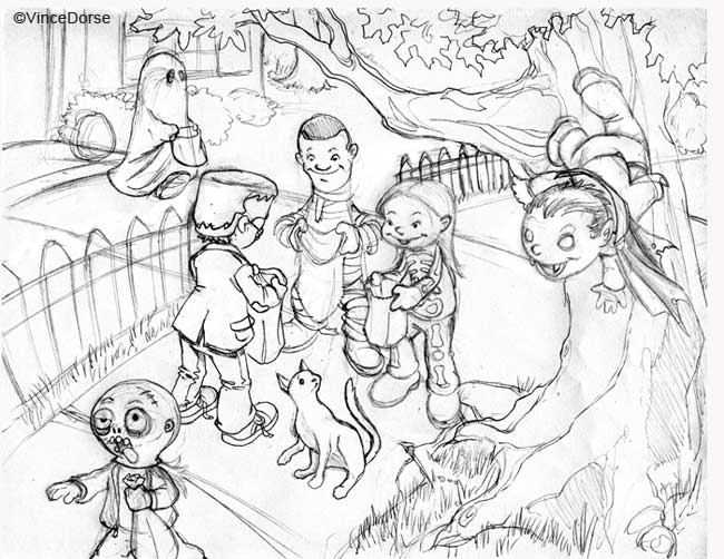
It's that time of year when I send off a personalized Halloween card to my good friend, Max. This is his third Halloween and I'm looking forward to the photos of the costume -- always a surprise. This kid, he doesn't even realize how good he has it yet. He's got at least a decade of trick-or-treating ahead of him before the neighbors start eyeing him up as some sort of trouble-making weirdo lurking around their porches looking for handouts. Some of us aren't that lucky.
So this time around, to celebrate his third Halloween, Max gets a trio of revelers enjoying the holiday. I know he doesn't really read or appreciate these cards yet, but his dad's hanging on to them. "I'm keeping them in a safe place," he tells me, "You know...in case you ever amount to anything." That's sweet.
I hope Max gets a wheelbarrow full of candy this year and that he has as much super-spooky-fun as I did when I was a kid. Same goes for everyone reading this. Have a great Halloween this year. Try to enjoy it like you were three years old. -v

October blew in with an icy rain this morning and I couldn't be happier about it. This bodes well for a chilly, grim Halloween season -- just the way I like it. The leaves are changing, there's woodsmoke in the air, and a few of the houses on my street have already got their cardboard jack-o-lanterns taped to their front doors.
So, in keeping with the season, I decided to do a quick breakdown of my process for my Sleepy Hollow piece. This illustration was done for the Pittsburgh Society of Illustrators directory, Drawing Under The Influence and will be hanging in the gallery at the Art Institute of Pittsburgh this winter. As well, the directory is still for sale at the venues where the show hangs. Ok, on with the work-in-progress steps...

Step 1) I start with a pencil sketch. I'm targeting the children's market so it's a fairly cartoony sketch. But it's a ghost story, so it has to be spooky too. Hopefully, my choice of colors will help that.

Step 2) Next I lay down a base color to help establish an eerie mood. There's gonna be a lot of deep indigos and midnight blues -- I want the forest to have a sense of foreboding -- so I work from dark to light, starting with the shadows.

Step 3) With all those brooding blues and greens in the background, Ichabod and his headless pursuer -- the focal points of the piece -- have to be rendered with contrasting, warm colors. So, layer upon layer, I build up some reds, browns and yellow-greens on Ichabod and his horse, Gunpowder. The Horseman's warm tones will come mostly from his fiery pumpkin.

Step 4) That flaming gourd also serves as one of my two light sources, the other being the moonlight. I keep all of that in mind while I'm painting in highlights and shadows -- the direction of the cast shadows, the temperature of the highlights and how the forms shift color as they move from light to shadow.

Step 5) I decide the Headless Horseman needs a ghostly mist swirling around him, so I paint that in with a soft brush at low opacity. A few more random shadows to add mystery and I'm done.


